Bonus •The True Size of Africa, What the Cards Never Told You
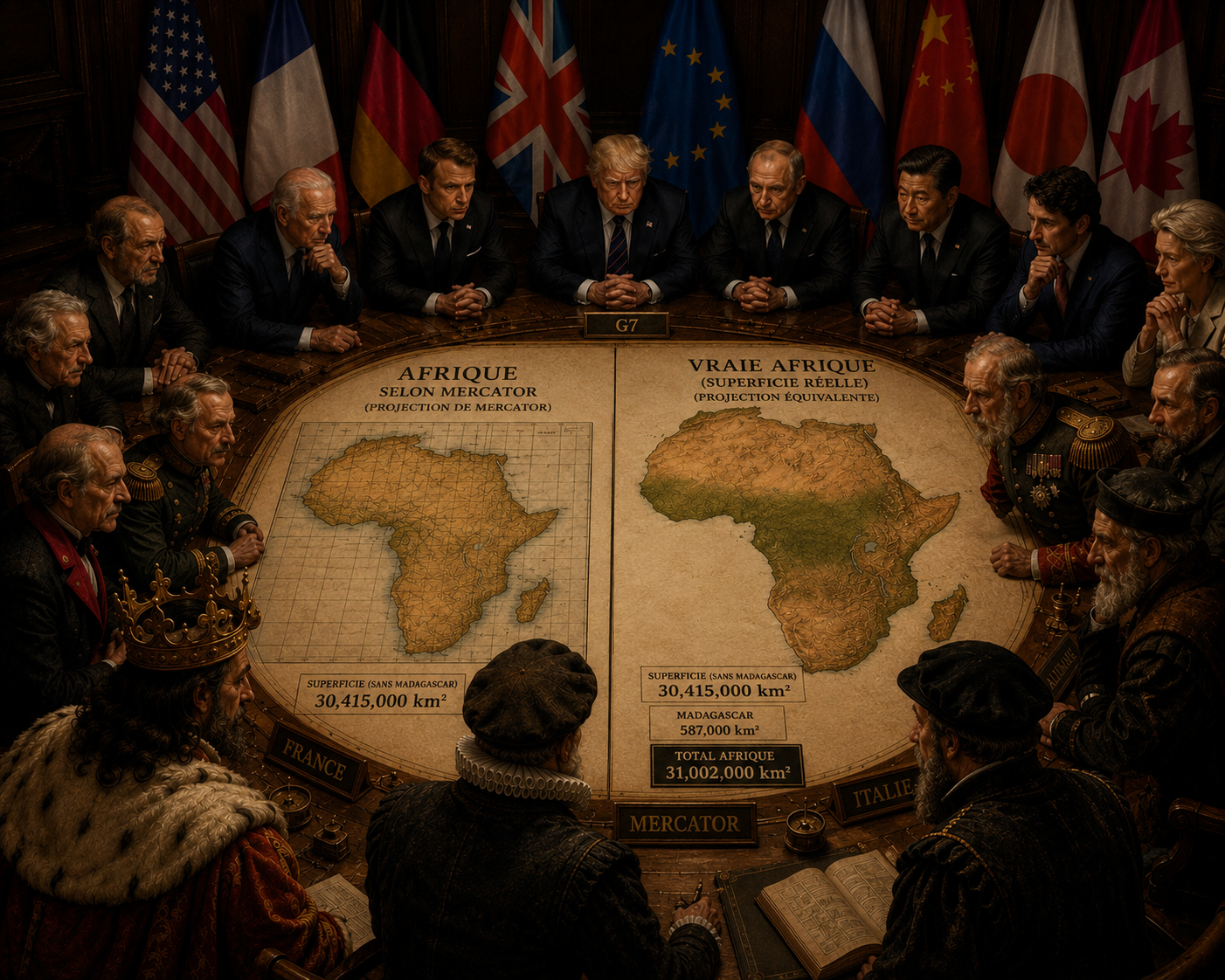
Sixty years of economic independence negotiated on a visual illusion that is more than 450 years old.
Look at a standard planisphere.
That of your textbooks. That of the conference rooms. The one that still appears, by reflex, in the world's collective imagination.
What do you see?
Greenland almost seems to rival Africa. Europe seems central, dense, naturally dominant. Russia and North America visually crush the rest of the globe.
However, geographical reality tells a different story.
Africa covers about 30.415 million km². It is nearly 1.4times larger than Greenland, more than one and a half times larger than Russia, and can hold the United States, China and India combined — with still space available.
How can a continent that represents more than 20% of the world's land surface appear so small in the world's collective imagination?
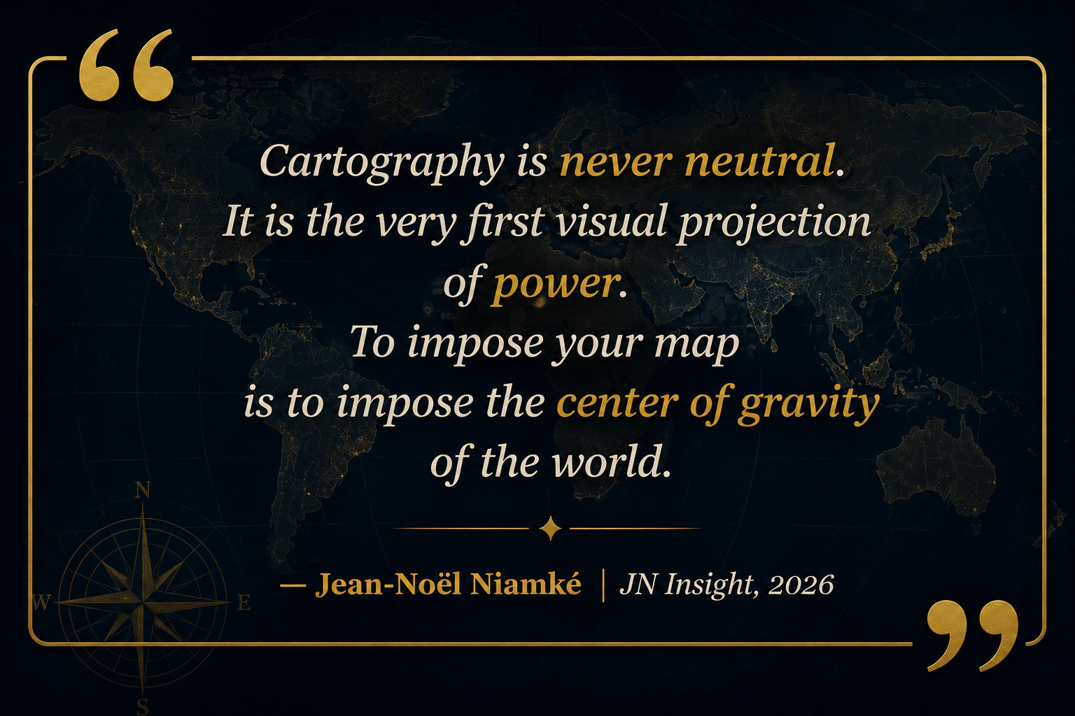
This is not a simple drawing error. It is a mathematical distortion that has become, over time, a global cognitive bias. And in geopolitics, what is perceived as small is often treated as secondary. The persistence of Mercator's projection in modern education and institutional representations is no longer a technical necessity: it has become a visual habit with political consequences.
Controlling the map means controlling the perception of power.
ACT I — 1569: the sailors' map became the map of the powerful
In 1569, the Flemish cartographer Gerardus Mercator published a map that would revolutionize the history of navigation.
Its objective is not to produce an accurate representation of the areas. It is maritime and technical: to allow European navigators to trace straight routes on a constant course, without constantly recalculating the earth's curvature.
To achieve this, Mercator preserves the angles. It's excellent for the compass. But this choice imposes a cost: the further away from the equator, the more the surfaces are stretched. Northern Europe, Russia, Canada and Greenland are artificially inflated. Africa, crossed by the equator, is not enlarged in the same way. It is especially undersized compared to the oversized polar territories.
The tool was remarkable for the galleons of the sixteenth century. The problem: it has remained the dominant mental model of the space age and 21st-century classrooms.
But the numbers don't really tell the whole story.
ACT II — The audit of territorial assets: what the figures really say
In finance, we don't work on visual impressions. We audit the assets. So let's audit.
- The Greenland complex : on Mercator, Greenland seems almost comparable to Africa. In reality, Greenland covers about 2.16 million km². Africa: 30.415 million km². The African continent is therefore about 14 times larger.
- The Russian mirage : Russia seems to occupy an overwhelming place on the world map. It covers about 17.1 million km². Africa is nearly 1.8 times larger.
- The interlocking of powers : the United States, China and India together enter the African surface. If we add part of Western Europe and Japan, the idea becomes even more striking: Africa is not a peripheral space. It is a continent-world.
A slight comparison between mercator and reality leaves you slightly speechless
📊 Mercator vs. Reality: The Territorial Assessment
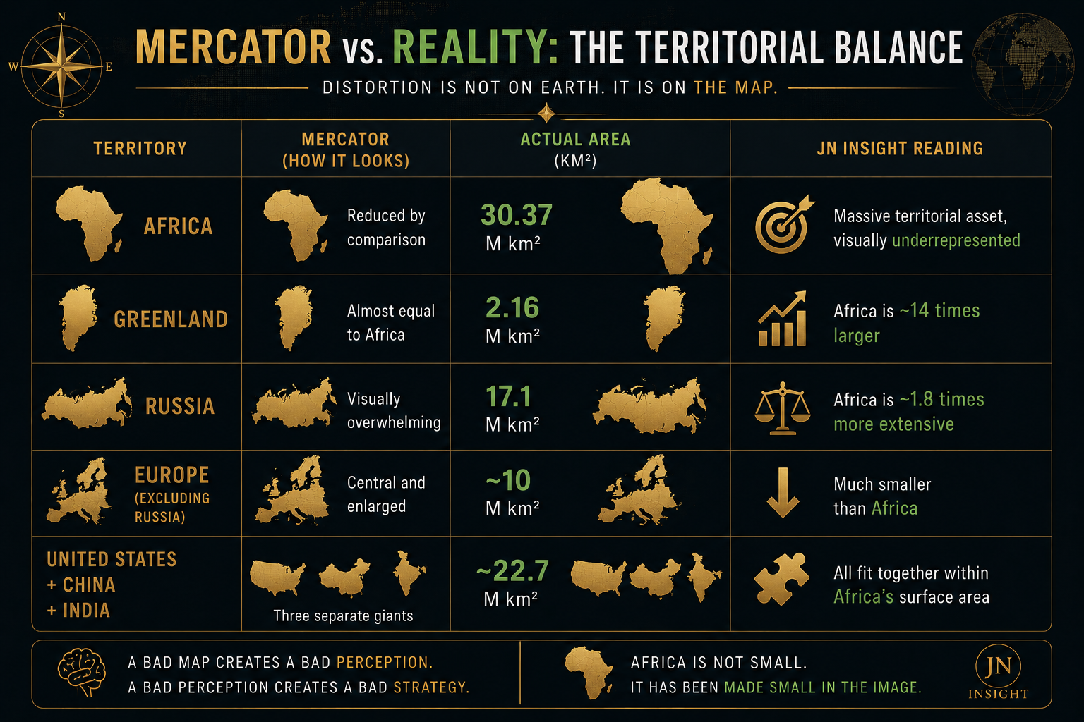
Africa is therefore not a "small developing continent". It is a continent-world that is under-represented in the image, undervalued in perception, and too often under-exploited in strategy.
ACT III — When a card becomes a balance of power
Why does this debate go beyond geographers? Because spatial perception shapes the economic psychology of investors, diplomats, leaders, and sometimes even the peoples concerned.
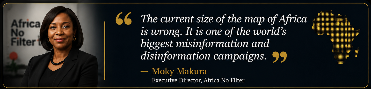
1. The underestimation of the AfCFTA market
The African Continental Free Trade Area, the AfCFTA, is often analysed through its cumulative GDP, its demography or its trade barriers.
Connecting Lagos, Abidjan, Kinshasa, Nairobi, Cairo, Johannesburg and Dakar is not only about connecting a few nearby capitals. It also means organising a continental market of more than 30 million km². If we think of Africa through a map that shrinks it mentally, we inevitably underestimate the scale of its needs: rail corridors, ports, cross-border roads, energy hubs, regional value chains.
The wrong map doesn't just distort geography. It distorts planning
And this obviously has an impact on investments.
2. Investment allocation bias
In the subconscious of many financial departments in the North, Europe and North America still occupy the central space of wealth and opportunity. A visually compressed Africa reinforces this bias: it appears as a distant, narrow, fragmented periphery.
But an Africa represented on its true scale forces us to ask another question:
What if the African continent was not a periphery to be helped, but one of the largest territorial assets to be structured?
It is precisely here that the map becomes a subject of sovereignty.
Moreover, one must have the intellectual honesty to note what this article measures, and what it does not measure
Rightly, this analysis is not a trial against geometry. Mercator is not "stupid". Mercator is not useless. Its projection remains historically major and technically relevant for certain uses related to navigation, orientation or certain digital displays.
The problem is not the existence of Mercator. The problem is its domination as a mental representation of the world. This article therefore measures the gap between:
- the initial technical function of a tool;
- and its prolonged use as an educational, policy and institutional standard.
In other words: a maritime navigation instrument has become, through inertia, a global cognitive architecture. And this architecture has taught generations of Africans to look at their own continent as smaller than it really is.
3. The African Union had sounded the alarm
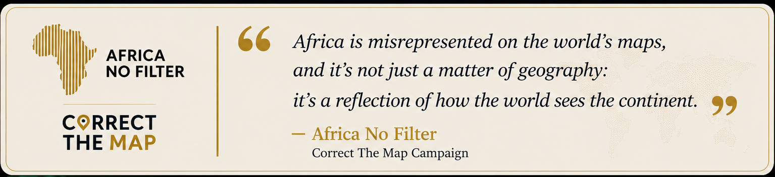
In 2025, the African Union officially supported the Correct The Map campaign, calling for the replacement of Mercator with the Equal Earth projection, which is more faithful to real acreage. This demand has gone largely unheeded in global educational institutions. Textbooks, digital platforms and conference rooms continue, for the most part, to use Mercator. The inertia is at once editorial, institutional—and perhaps also political.

KEY FIGURES — Reality in the face
ACT IV — Taking up the map, taking up the scale again
If this distortion has been known for a long time, why does it continue to inhabit our schools, our atlases, our institutions and our imaginations? Through inertia, editorial dependence, and institutional laziness.
And perhaps also because some images suit the established order better than others. The solutions exist:
- Gall-Peters projection : it respects the proportionality of surfaces better, even if it distorts the shapes more. Its interest is political and pedagogical: to show the continents on a fairer scale.
- The Equal Earth projection: created in 2018, it seeks a balance between respect for surfaces and visual readability. It is this projection that is now being promoted by the Correct The Map campaign, supported by the African Union.
- The AuthaGraph projection : developed by Hajime Narukawa, it greatly reduces certain distortions and offers a more continuous reading of the globe. But it must be presented precisely: it is not a projection strictly equivalent to all infinitesimal scales, even if it corrects several major defects of Mercator.
The point is therefore not to find a perfect card. No plane map can be. The point is to stop using, in order to think about the world, a projection that massively distorts the relations of size in favor of high latitudes.
PRESCRIPTIONS — Three measures for cartographic sovereignty
1. Sanctuarize the reform of school textbooks
African ministries of education should gradually replace the Mercator planispheres with projections that are more respectful of the surfaces, in particular Equal Earth or Gall-Peters, from the primary cycle.
An African child should not discover his continent through an image that crushes him.
2. Rethinking the logistical assessment of the AfCFTA
Development banks, states and regional institutions must integrate the true African territorial scale into their models.
Building an African continental market is not about "fluidifying a few borders". It means organising the movement of goods, capital, data and people on the scale of a continent of 30 million km².
3. Audit the institutional visual identity
Embassies, ministries, central banks, regional institutions, universities, African think tanks: all should use equivalent or more balanced projections in their official media. Sovereignty sometimes begins with a detail on the wall.
What to remember – The territory of the mind
The greatest strength of power mechanisms is not always to coerce by force. Sometimes it's formatting with images.
For centuries, Africa has been looked at through maps that did not give it back its true scale. This alone did not create economic dominance or diplomatic asymmetries. But it was part of something more discreet: a mental understatement.
However, a nation, a continent, a generation never projects itself in the same way according to the image it has of itself.
An Africa that sees itself as small negotiates small.
An Africa that sees itself on its true scale is beginning to think differently.
→If African children finally saw their continent on its true scale, would they negotiate their future tomorrow with the same audacity?
Intellectually yours,
Jean-Noël Niamké
FINANCIAL EXPERT
The Mechanics of Power — Bonus Edition | Strategic & geopolitical analyses